Welcome to my portfolio!
If you'd like to see some of my older work - please feel free to browse through this website.
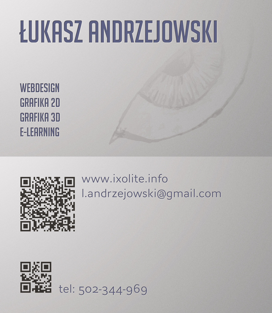
If you'd like to contact me - send me an email at: l.andrzejowski@gmail.com
or visit my LinkedIn profile.
Web design
Website for indie game developers
Design and implementation
Wordpress, HTML4/5, CSS2/3, PHP, jQuery

http://wiadomosci-archeologiczne.pl
A fully responsive website dedicated to the oldest Polish periodical of archaeology.
This site was designed with mobile users in mind. The page layout is "fluid" and it adapts to the user device screen size (both tablets and phones) as well as desktop browser window size. The page is displayed using single HTML code, regardless of the size. The layout is modified using only media queries in CSS style sheet.
Website for indie game developers
Design and implementation
Wordpress, HTML4/5, CSS2/3, PHP, jQuery

Another website created on Wordpress CMS foun- dation. It features many elements tailored specially for this client.
There is an option of pinning selected news items on the main page, allowing them to always stay on top, regardless of pagination and new entries being added.
The games page has its tiles generated automati- cally, based on values of custom fields attached to each game details page. Similarly, the additional game info, displayed on the sidebar, comes from custom fields of each game’s details page. Thanks to that all information and page elements related with a given game can be configured from one dashboard screen. Moreover each game has its own slideshow, separate from any other page.
There is also an option of setting up a separate background for each and every page and news/blog entry. The sidebar contains last tweets from two Twitter accounts. The main menu and the social contact menu placed in the sidebar are fully configurable from the dashboard. The page archives are hidden away from the main page view – they are accessible via search results page and categories and tags search pages.
Website for indie game developer
Design and implementation
Wordpress, HTML4/5, CSS2/3, PHP

This site was built for the Great Moa based on WordPress 3.1 CMS engine. Whole website was created from ground up, according to requirements outlined by my client and it is has four major parts: the homepage, containing the news entries; the blog; entries for games by MoaCube; static page about the MoaCube team. Entries in each of those sections are maintained via the CMS. Also the main and sidebar menus are configurable from the dashboard. Pretty much every bit of content can be managed without modifying the site’s theme.
Promotional site for Gamedec saga by Marcin Przybyłek
Design and implementation
Flash


The history of this site started with me seeing the awesome artwork by Marcin Jakubowski, based on the Gamedec universe created by Marcin Przybyłek. Come to think of it, it all started even earlier. The short stories about Torkil Aymore, a game detective, fascinated me enough to take a closer look at authors prose and the author himself. Marcin turned out to be an extremely positive guy, full of interesting stories and good vibes. He is also a man of vision which he works hard to turn true, enchanting a lot of cool people in the process. I let myself getting charmed as well.
Getting back to the artwork: when I saw it for the first time, I thought it would be a perfect background of a multimedial promotional site for Gamedec. Suddenly, all the pieces started to fit together and I more or less knew what could I do if I had this artwork at my disposal. During one of the meetings with Marcin I outlined him my idea – he did show interest so I prepared couple mock-ups. Those were approved and that is when the work on the site has begun.
The site was supposed to accompany the promo- tional events for the latest Gamedec saga part. Due to the delays in premiere, we added couple elements that were not previously planned. The commercial spot, streamed from outside file, was introduced – it was still being worked on when I originally started my work on the site. Robert Letkiewicz composed the music that you can hear on the site today, I also added encyclopaedia that was stylized to match the video spot.
I improved various elements of the site during whole development time. These include fixes in the interface, moving the links hardcoded in flash to outside configu- ration files or optimising the video and audio encoding. Also, the English version of the site was finished and launched.
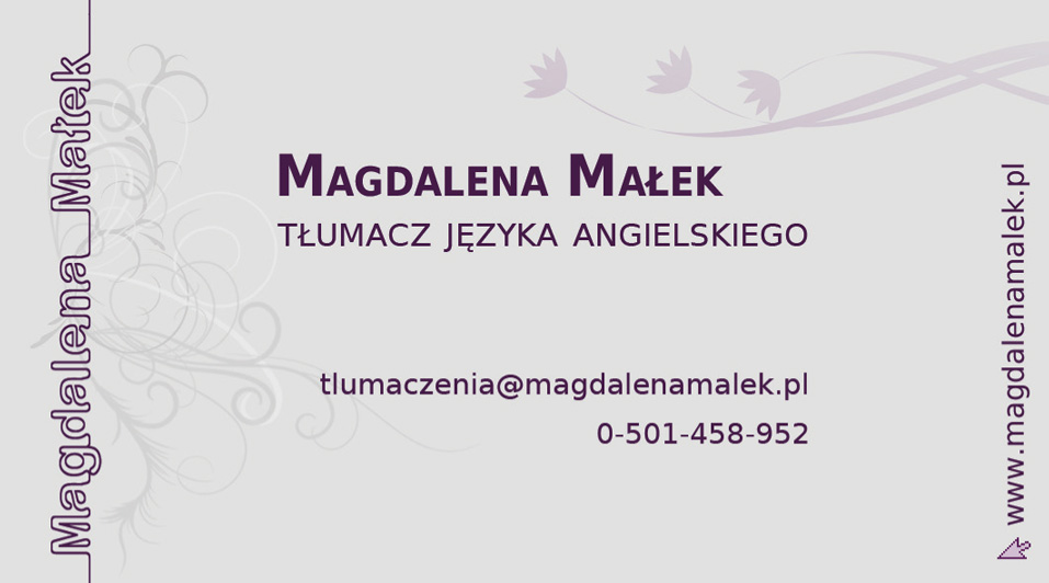
Website for a Polish-English translator
Design and implementation
XHTML, CSS, PHP, jQuery

Minimalistic page with toned-down colour scheme. Single column layout, a lot of breathing space and subtle floral decoration create a clean and elegant appearance. The non-professional part of the page layout is different but still based on the same design – the page header and colour scheme are slightly altered. The photo gallery carousel is powered by jQeury.
Demo page
Design and implementation
XHTML, CSS, PHP, jQuery

Created as a demonstration for Codeminion, this site was finished in less than three days. Its aim was to provide a short presentation of Magic Match game. In order to reduce clicking through to small sub-pages, I prepared a jQuery-scrolled single-page site, based on graphics from the game.
The site that you are currently browsing
Design and implementation
XHTML, CSS, PHP, jQuery
Research application for my master's degree thesis
Design and implementation
Flash, PHP

[...]
3.1. The aim of the study
The aim of the study accompanying this thesis is to compare the influence of two different methods of information presentation on effectiveness of the teaching course. The aim of the analysis of differences between the course containing only textual information and courses containing multimedial elements of illustrations and animations is to indicate the most effective method of information visualization in e-learning course. The advantages and disadvantages of each method of information visualization will be presented as a result of the analysis.
[...]
3.5.2. The application structure
The application consists of three main components: the teaching course, randomly selected from three versions, the test checking the knowledge gained from the course and finally the questionnaire ending the study. Each component was supposed to be separate and imported to the core application dynamically, partly because of the size differences between the teaching course versions. Some technical difficulties arised during the application development though. For example a reliable way of randomising the teaching course selection had to be supplied, proper results gathering had to be ensured (and a way of results identification) and proper user interface operation had to be provided. The earlier solutions proved to be inadequate and loading whole application before each testing session was the final design choice.
Results of each testing session were easily identified thanks to including all components into single application: the only way of starting a new testing session is loading whole application from the server again. The test session ID and the participant IP are written to the database only after the application has been started. Requiring to load whole application again is also supposed to discourage participants from trying to obtain any particular type of the randomly selected course.
The participants cannot freely move from one stage of the testing session to another. Finishing each stage results in writing the gathered data to the database and moving on to the next stage, with no way of coming back. The only way of reaching earlier stages of the test session is to re-load and re-start whole application and testing process.
[...]
3.6.1. The interface
The application interface is uniform and common for all teaching course versions and all testing session stages. Because of the aim of the study, interface is kept in toned-down, light grey colour scheme with distinct but not distracting navigation elements. Interface is supposed to serve only functional purposes so it doesn’t influence the perception of graphical elements included in the teaching course content.
Website for an exhibition at National Museum of Archaeology in Warsaw
Design and implementation
XHTML, CSS, PHP

http://www.pmawystawy.pl/liwiec/index.php
Lightweight informational site of Time and the River. The Valley of the Liwiec in Late Antiquity past exhibition at National Museum of Archaeology in Warsaw. Simple shapes, colour scheme based on exhibition’s scheme, clean, elegant and readable. The gallery is handled by ShadowBox.
Company website
Graphic design

Aesthetical, ecological...
...and in Scandinavian Bio Heating Systems company colours. Bright, lively colours, details such as menu ribbon stretching across the full width of the site, subtle pattern in the background and graphics defining the content layout – all of that comes together to form a warm and friendly image, perfect for a company dealing with ecological heating systems. Menu was enriched with illustrations, accompanying each category and subca- tegory, making the navigation more intuitive and aesthe- tically pleasing. The website was used in this form in years 2006-2007.
Company website
Graphic design

My boss...
...despite some initial resentment, finally agreed to a rounded layout. Thanks to that our website stood out, since a lot of our competition used layouts that strongly reminded templates, offered by couple popular theme sites. I wasn’t too happy about the symmetry-breaking menu and online-shop column, but I didn’t have much say in that matter.
Official author's website
Graphic design

Orbit’s page...
...came forward slowly. At times communicating with Łukasz and getting anything specific out of him was a bit tricky. This website was created when the server housing the previous one irreversibly and irrevocably died without warning. Łukasz Orbitowski writing revolved around urban climates at that time. I received a packet of photos from him, including hooded author himself, which were the basis of graphic design of the site. I also added a logo, drawn according to Łukasz guidelines and the site was ready to go. It lasted for about an year and a half in this form, before being replaced by another design, better suited to Łukasz more recent prose.
Company website
Preliminary graphic design


Graphic design created in couple days to include in offer for SOS PZMOT. The requirements included using four colours: black, white, yellow and red. It was also supposed to have a business style with two separate parts – for individual customers and business customers.
Graphic design created in couple days to include in offer for SOS PZMOT. The requirements included using four colours: black, white, yellow and red. It was also supposed to have a business style with two separate parts – for individual customers and business customers.
There is some room for improvement, like better use of colours to emphasize certain elements of the page better or making the icons more readable. The project never left the early design stage though since another offer was chosen by the client at this point.
MakeUp artist portfolio
Implementation based on provided design
PHP, HTML, CSS


This is how a site...
...created for an acquaintance of my friend photographer was supposed to look like. The point was to quickly make a simple portfolio, according to provided graphic design. It was all completed in a few evenings – only thing I didn’t like about the design was the size of navigation elements, but it was something to be fixed easily in the CSS.
Website for National Museum of Archaeology publishing house
Design and implementation
PHP, HTML, Javascript

http://www.pma.pl/wydawnictwa/
TThis project was an interesting experience (‘May you live in interesting times’ type of experience) – I didn’t have even slightest idea what the server configuration will be, what services are there or even if there is any database running on it (looong story). One thing I could be certain of was that PHP was running on it. As a result the page, that should be getting its content from database, was built around a complex system of PHP includes and hundreds of static text files holding the content. That allowed me to retain the ability to introduce changes without affecting the content – not a perfect solution but it worked.
The looks of the site however is a consequence of lack of graphical design, fighting with Internet Explorer 6 and having all of the site content in text files. Not having the graphic design (which was supposed to be provided by the client), I had to make some assumptions regarding the layout and the Internet Explorer caused the site to be table based – partly because the hand-made hyphenation would break in some browsers otherwise. Most of the content is provided in tables anyway so that wasn’t such a big price to pay for uniform look in every browser.
When the time to place the site on the server came I still didn’t have the graphic design. The fixed, table based layout, didn’t give much room to manoeuvre, and redesigning it would require editing couple hundred files – because of the fixed hyphenation among other things – in the end the look of the site is a compromise between what I wanted done and what could be realistically done...
Building the whole website was a lot of work. I had to work not only on the code but also deal with the lack of the database, enter more than a hundred of tables of contents into, well, tables, and prepare all of the graphics, including scanning of the books covers and illustrations if no electronic versions were available.
Despite the difficulties, I can call this project a successful one – the website serves its purpose well.
Old portfolio
Design and implementation
PHP, HTML, CSS, Javascript

This is how my previous portfolio looked like.
While I was working on the Xortec website graphical design, I prepared couple versions that used a lot of transparency. They were not used in the final project but I liked the idea enough to use it on my portfolio.
There were couple problems left to solve – first and foremost was to deal with Internet Explorer 6. Actually, this was the only problem per se. IE6 can’t display 24-bit alpha transparency .png files (which were used for all transparent elements of the page) – this issue was solved thanks to javascript and pngfix. In addition, IE6 has a rather loose standards interpretation: it uses margins and displays fonts differently, it doesn’t cope with floating elements... Here you can see how IE6 breaks otherwise perfect page. After some fiddling with CSS I managed to prepare a two-column template with navigational elements using transparent graphics. The whole thing would require a major overhaul in order to be used on normal page, but it served my purpose perfectly.
Personal website
Graphic design: b2evo skin

This is how my old personal site looked like.
It was a small personal site, created to support my activity in various places. I was looking for a simple CMS that would support managing a multilingual content. The site was supposed to be simple so I left out solutions such as Joomla or Drupal – too complex for my needs. At the time, I really didn’t want to learn a complex system just to strip it off most of components that I wouldn’t need. I wasn’t thrilled about having to make a custom skin for a system I had no prior experience with. Finally I decided to use b2evolution.net – CMS similar to WordPress but having a couple interesting features working out of the box, including the ability to create a multilingual site. Modifying one of the skins provided on the b2evolution website to suite my needs was pretty easy too, which of course was an added bonus. Unfortunately, in time the gap between b2evo and WordPress grew larger and larger. Moreover latest updates didn’t get good Polish translations so I decided to drop that system after about two years.
Banners
...created for Arena Gier (Game's Arena) portal
Design and implementation
jpg and animated gif


From the top:
- Forgotten fronts – feature about computer games devoted to less known fronts of first and second World War
- Two parts of Half-Life 2 walkthrough
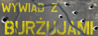
- Interview with the makers of (might-have-been) polish RPG “Bourgeoisie: The Pearl Of The Wasteland”
- Article presenting the (then) new Xbox360 console
- Article comparing the current-gen consoles
- Banner promoting one of the contest held by Arena Gier
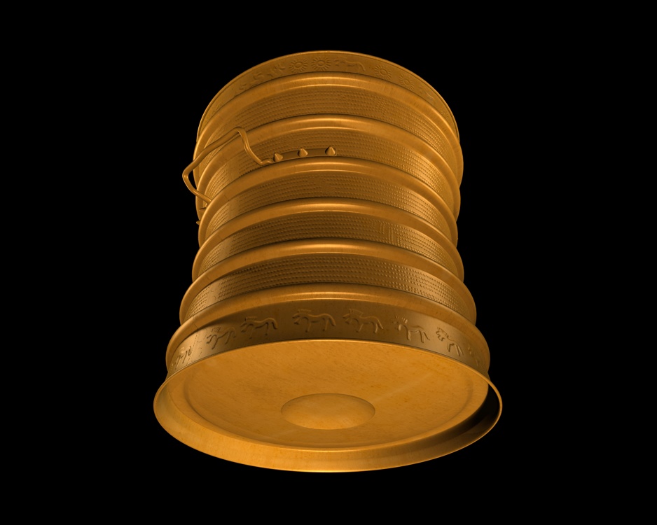
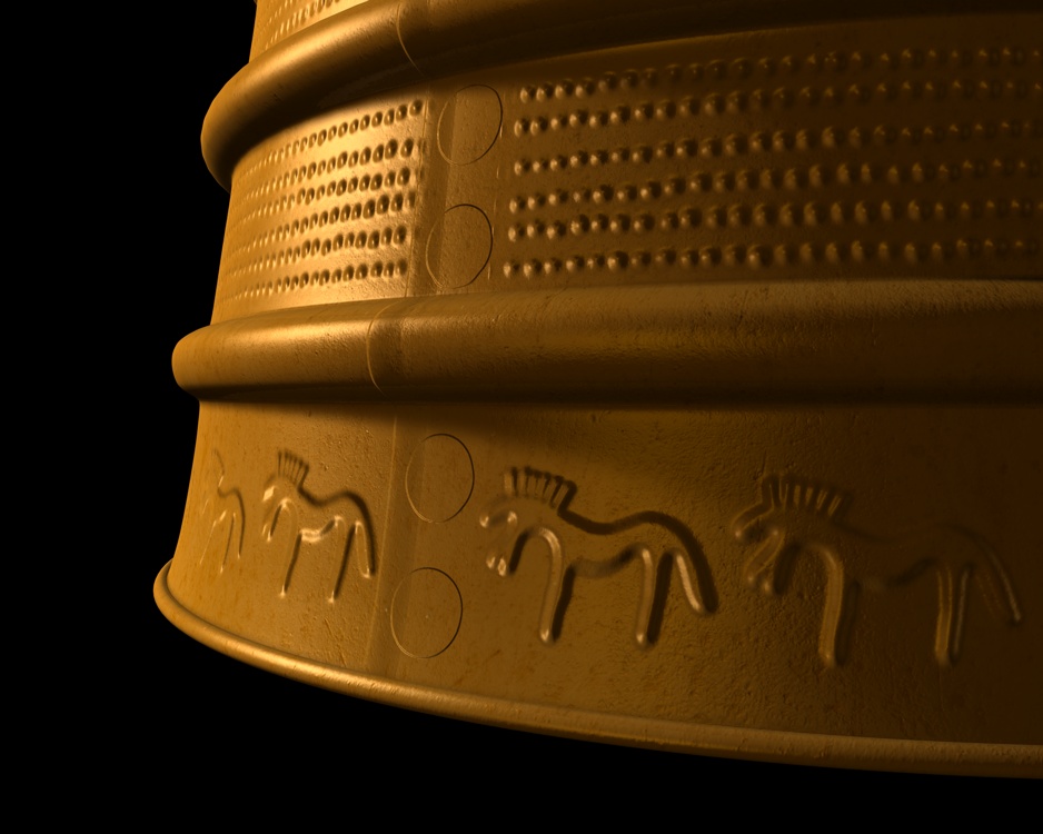
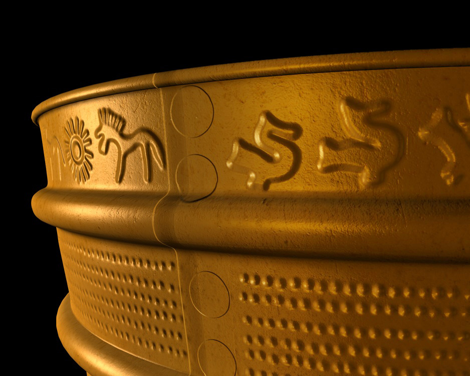
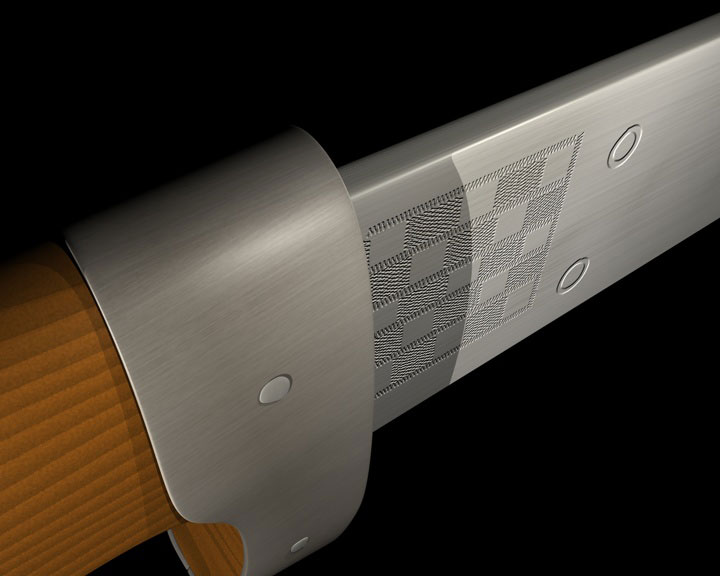
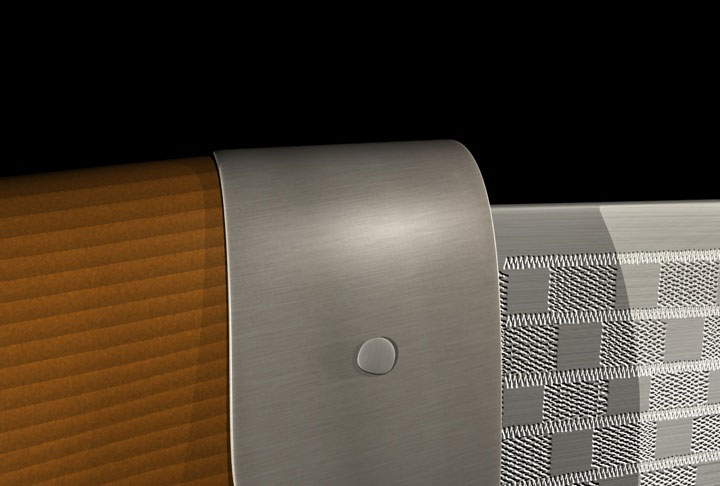
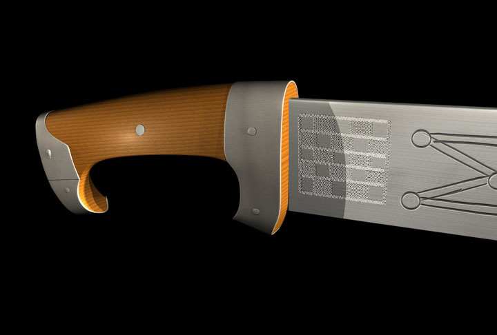
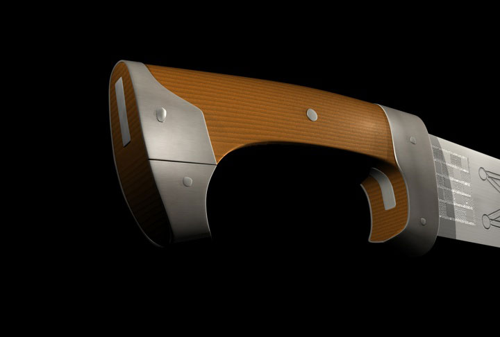
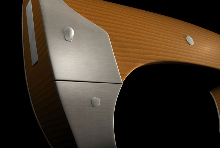
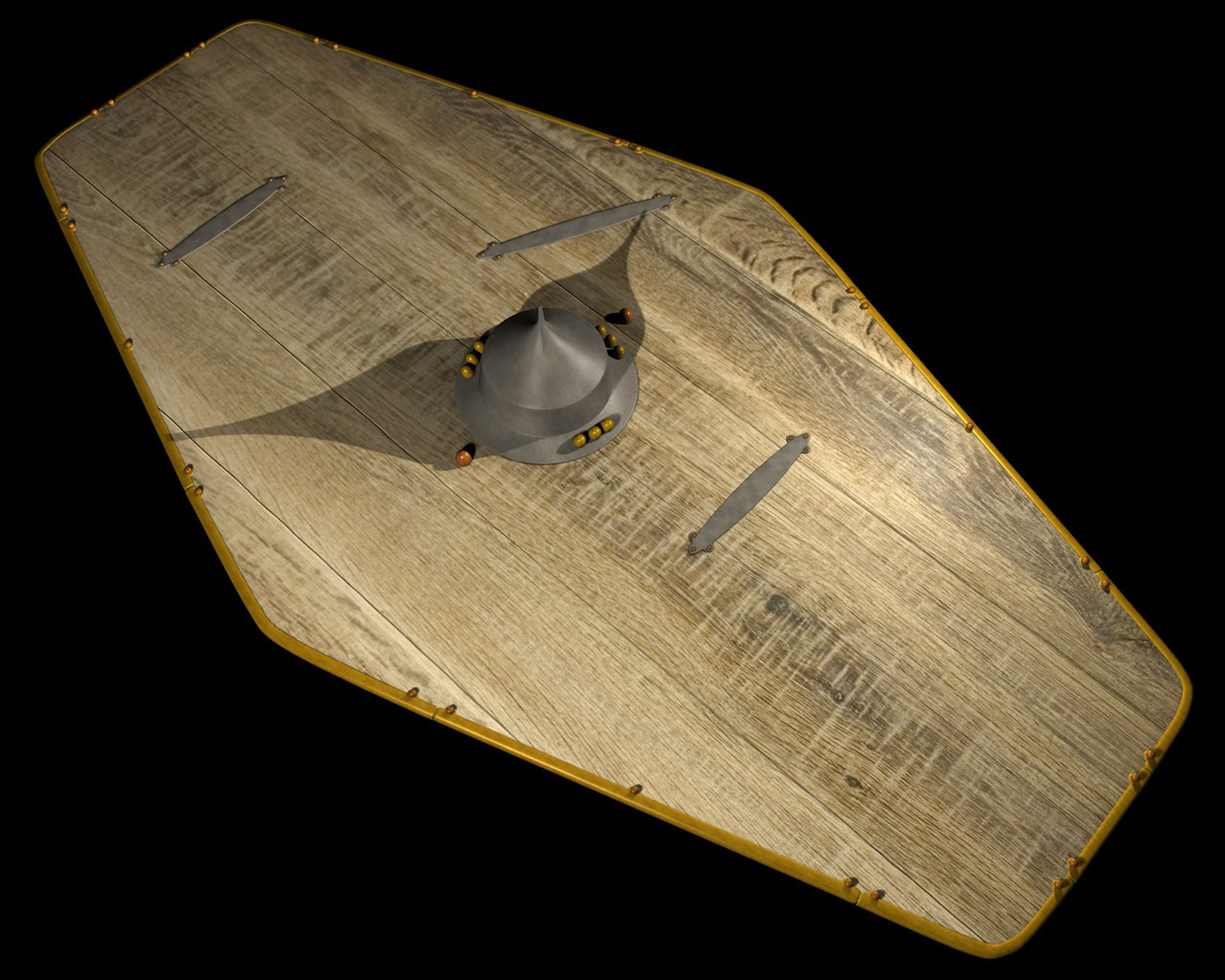
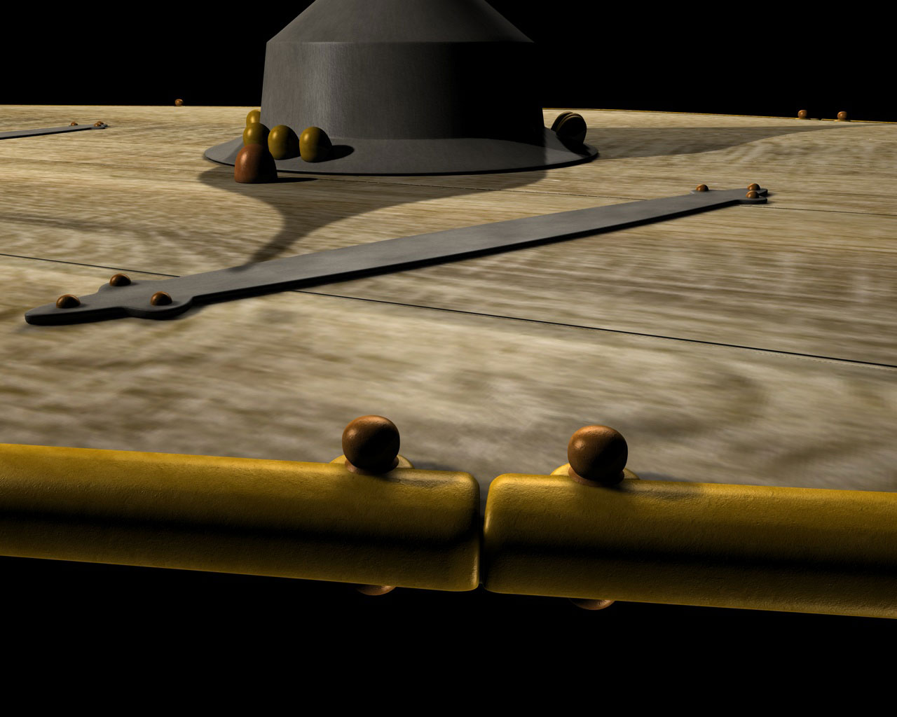
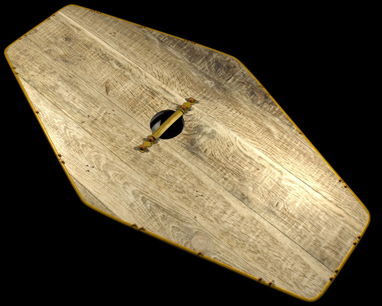
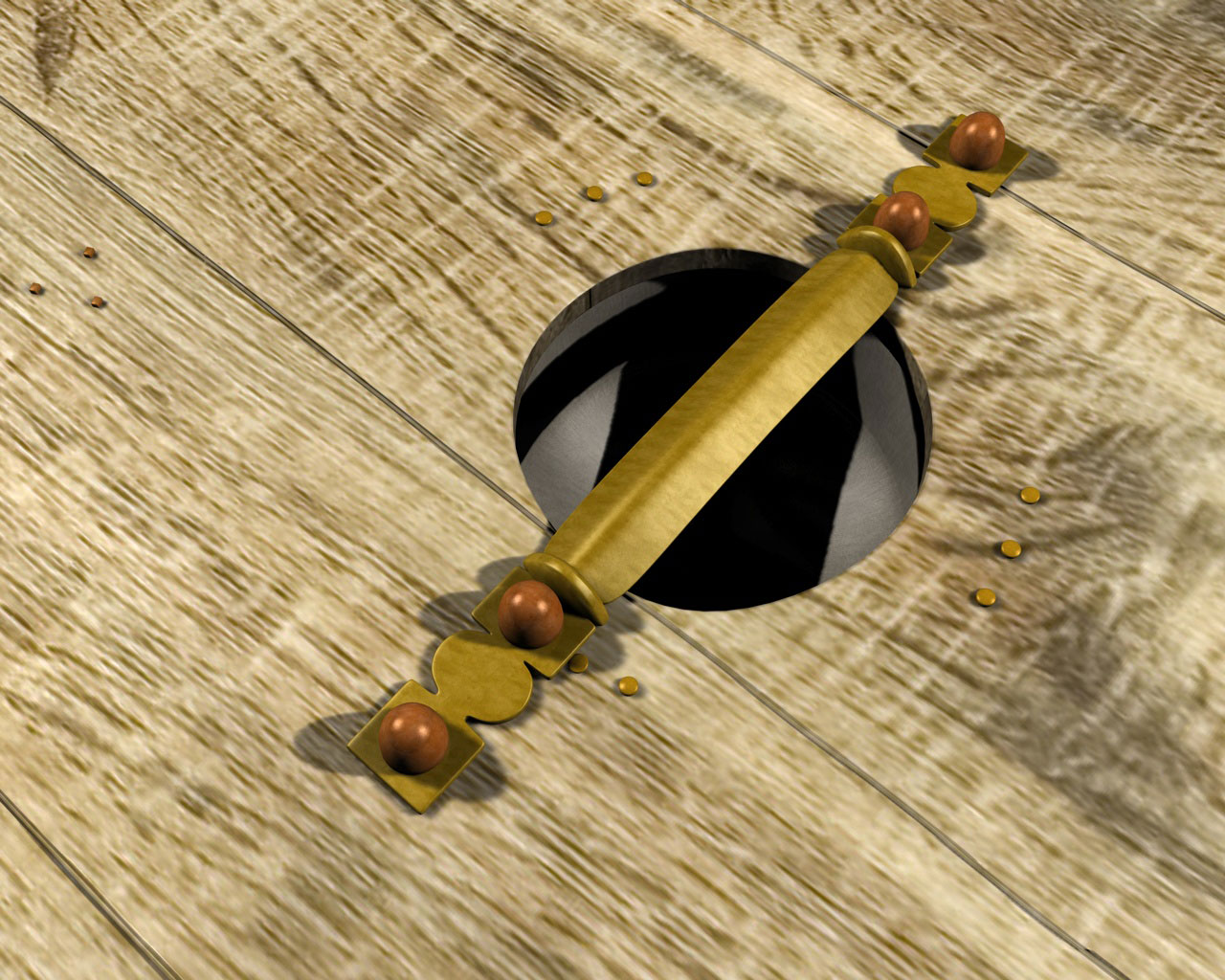
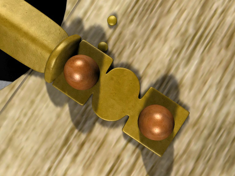
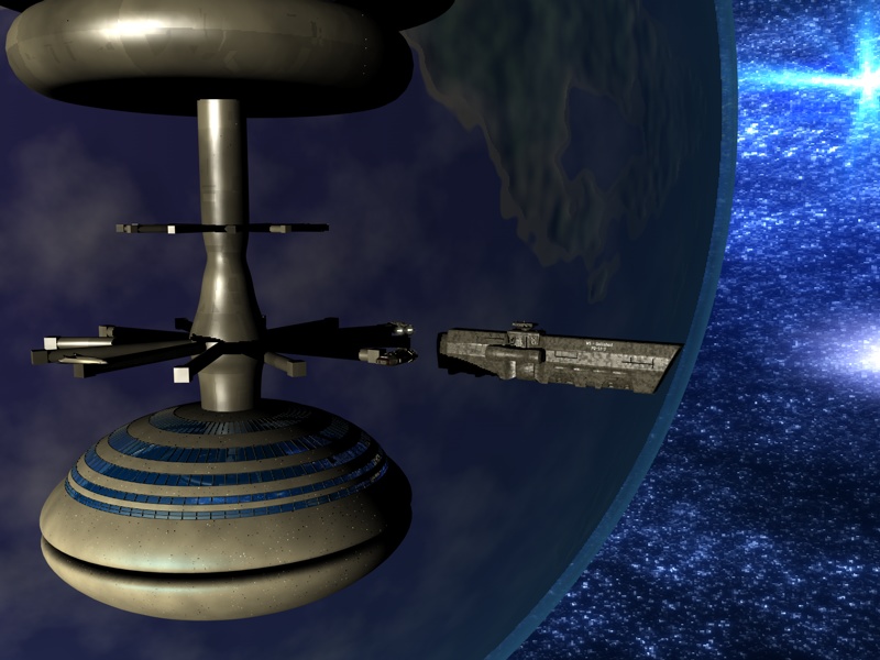
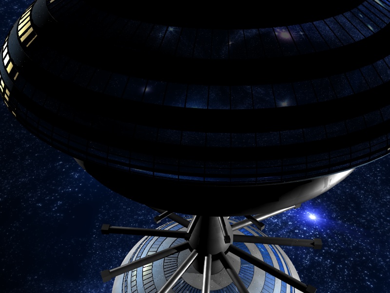
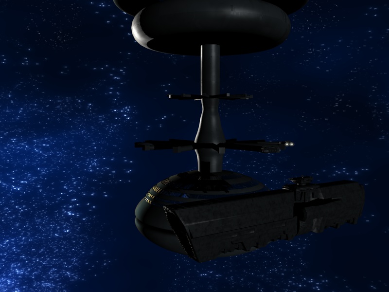
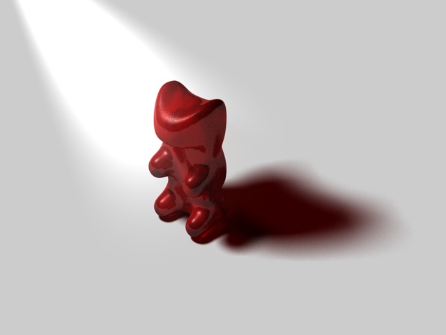
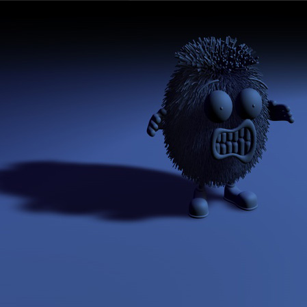
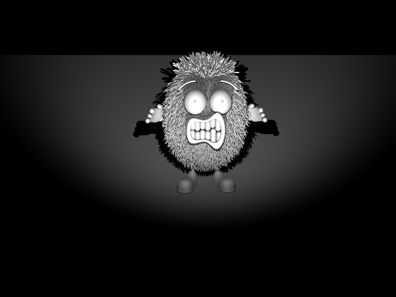
3D graphics and animations
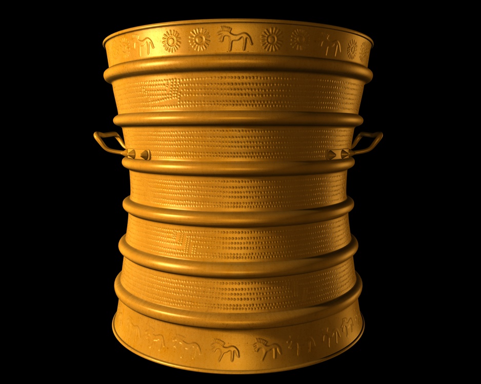
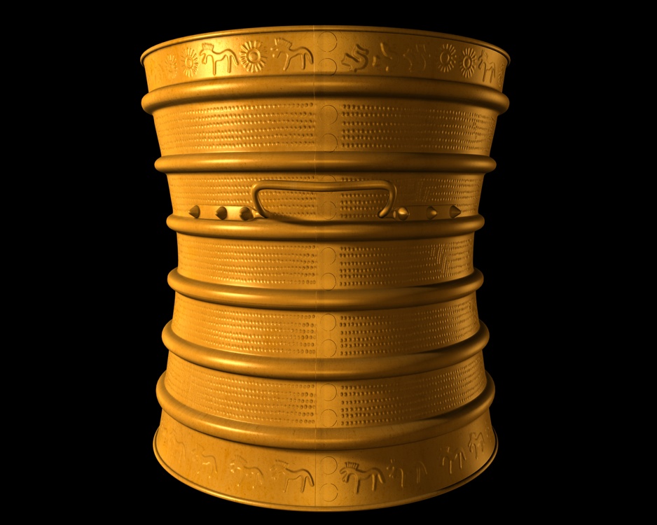
Reconstruction created for the permanent exhibition at National Museum of Archaeology in Warsaw
Cinema4D, Photoshop, Premiere
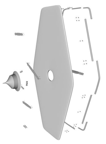
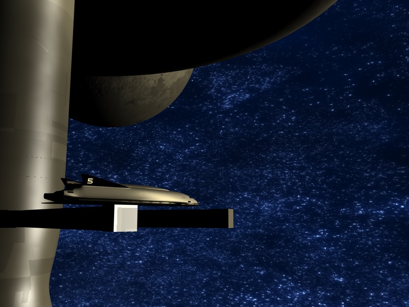
The effect of my engineering diploma
Cinema4D, Photoshop, Premiere
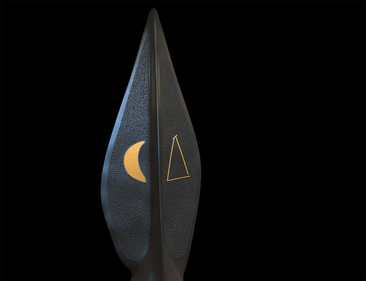
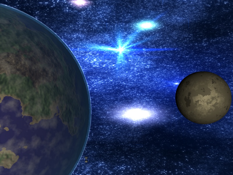
School project
Cinema4D, Photoshop, Premiere
Selected 3D projects
Cinema4D, Photoshop
Pixelart
You can find my pixelart works at ![]() Pixeljoint
Pixeljoint
Miscellaneous
Photoshop, Illustrator, InDesign
Photoshop
April’s fools graphics created for literary forum Mirriel.net
The forum skin, named “Sheep vision” by the forum crew, is a re-skin of
"Green Vision".
The padlock from the second screenshot was drawn from scratch in Photoshop, based on a reference photo.
 Forum skin (Photoshop)
 Padlock(Photoshop)
Turning new into old
Photoshop, GIMP
Used and unused designs
Photoshop
Fragmasters
Logo made for a Team Fortress 2 clan. The second image is an icon that was used in Steam platform.
Nautilus - readers award logo design
SFFiH SETI@Home team logo
Joke at first, it became the official logo of SFFiH Seti@Home team. It was inspired by NASA patches a bit (font and style) and, naturally, it includes a reference to unstoppable fandom power.
Game Hunters
Arena Gier and Magazyn Areny Gier
Forum image signatures
Photoshop
A short story about the sheep loving banditlier
Photoshop
Selection of smaller projects
Photoshop
- Easter card
Drawn from scratch in Photoshop - Opera wallpaper – started as my entry for Opera Speeddial contest, finished as a wallpaper.
You can download it here - The eye
A pencil sketch, scanned and digitally manipulated, it serves as my avatar for couple years now. - Backgrounds for Magazyn Areny Gier (Games Arena Magazine)
The first one in screen friendly format, the others are facing pages in A4 size. The DTP work quality in first magazine issue is, let’s say, lacking. The following issues avoided at least the most glaring mistakes. But, taking the hobbyist and in many aspects amateur nature of the magazine, I’m rather happy of the end result. Especially in the graphics department ;)
You can check out the four issues of MAG that we managed to publish by clicking this very link. Yes, the first issue _is_ a disaster :P
 Easter card
 Opera wallpaper
 My avatar
 MAG background
 MAG background
 MAG background
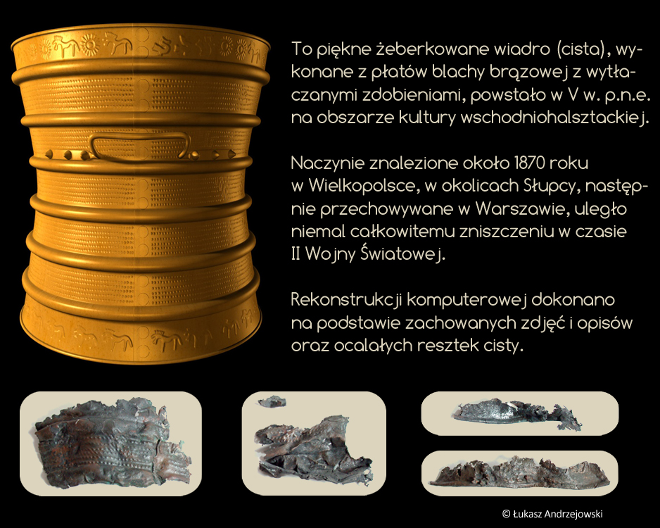